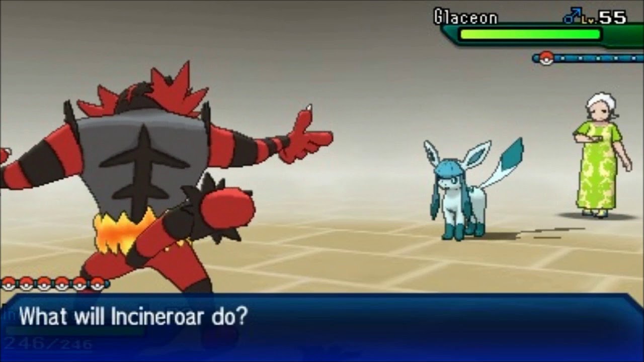
 As you can see, there are numerous examples of the principles and elements of design in this screenshot for the Nintendo 3DS game Pokemon Ultra Moon. One element that initially stuck me was the colors. Each and every individual character has their own color to match their personalities. For instance, the giant red tiger ( Incineroar ) is red, which matches its powerful and passionate, or fiery, personality. It is obvious that the Nintendo company put lots of detail into this image, but also things like the positioning. Both of the Pokemon are positioned in opposite corners, and neither are centered. This factor gives the image a sort of perspective. I also like how the game artists used simplification in this battle scene to keep the focus on the main characters and their vibrant colors.
https://www.nintendo.com/games/detail/pokemon-ultra-moon-3ds 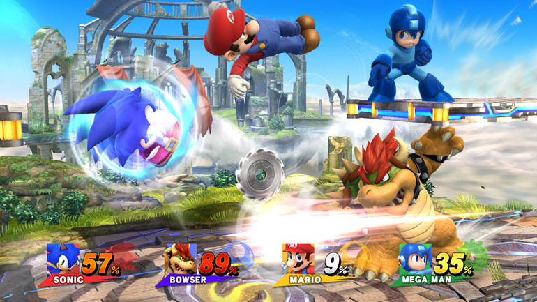 This screenshot from Super Smash Bros also uses the Rule of Thirds to position its characters, but instead of using simplification to nullify the background the game artists decided to put more detail into it. There are, like int the first game screenshot, many vibrant colors used to express the character's individual personalities. However, this Super Smash Bros screenshot lacks digital perspective, while it is common in the game itself. Overall, both screenshots show that both games use various elements and principles of design to make their game play more intriguing and engrossing for the players of their game.
1 Comment
 Pokemon Soul Silver and Heart Gold (SS and HG) are honestly one of my favorite older Pokemon game pairs. These two games were released late 2009 in Japan, and early 2010 for the other countries that sold it. I bought my first Soul Silver game from GameStop in 2015. Ever since then, I have had an enormous love for the game. Even though SS and HG are remakes of the original Pokemon games Silver and Gold, I am really appreciative of the developmental progress these two games have made. For an older game model, it has pretty good graphics and the plot itself is pretty good too. It also has a wide variety of in-game options and things to do. Overall, I would give this game a rate of 8/10 for its time. 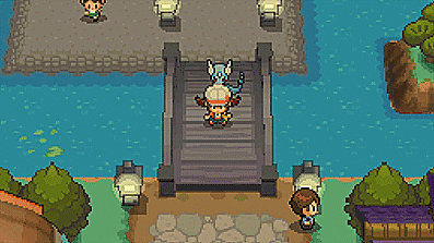  The game The Legend of Zelda: Breath of the Wild is a very popular game that was first introduced on the Nintendo Switch in early March of 2017. This game has a large game play map, and lots of details were put into every pixel of it. Another thing that had a lot of detail put into it was the color. Breath of the Wild is a very beautiful game, and it is known for being considerably realistic. This game has a wide variety of things to do, from whacking blue moblins with a twig to dying your clothes and battle armor. One thing about color that sticks out to players is the color blend of the Hylian Tunic and the famous Master Sword; a bright blue. The color bright blue is a color that represents calmness, power, stability, and trustworthiness. This game can be very stressful for inexperienced players, and especially the game mode called Master Mode, where the monsters are harder to beat. I think that the creators chose blue for the main character Link's clothes and weapon to be blue to reassure and calm the players who might be experiencing some difficulties in the game. It is also the same with the monsters. In regular game mode, silver is the highest level of monster, and the color silver is typically associated with persistence, overwhelming power, and greed; all traits shown by the silver monsters in the game. So yes, a lot of details were put into the characters and monsters, but also a lot of detail was put into the background BOTW world as shown below.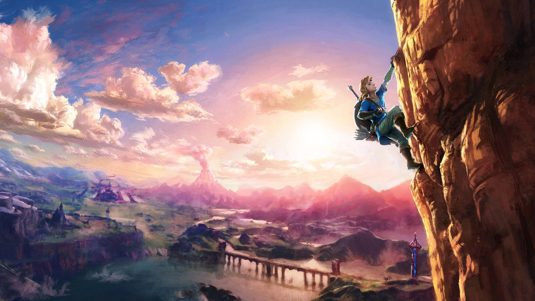 So overall, Eiji Aonuma and the Nintendo Entertainment Planning and Development have put a lot of effort and thought into the development of this phenomenal game. Not only did it top the gaming charts, but also topped our time management charts.
http://www.darkstation.com/reviews/the-legend-of-zelda-breath-of-the-wild-wiiu-review https://www.nintendo.com/games/detail/the-legend-of-zelda-breath-of-the-wild-switch |
